The Oppo F11 Pro looks similar to the leaked product renders of the OnePlus 7.
Ben SinThe worst kept secret in the smartphone industry is that Oppo, Vivo, and OnePlus all share the same parent company, and sometimes production lines in Dongguan too. And if you count the two sub-brands recently launched by Oppo and Vivo, that means we have five brands, all technically under one giant corporate umbrella, launching products in the same industry.
To be fair, their products do not overlap too much in terms of targeted audience and region, and most of their devices do differ significantly from one another in software and hardware–with the noticeable exception being Oppo and OnePlus, whose phone hardware have been closely tied.
For the lack of a better term, OnePlus handsets have been repackaged versions of Oppo phones for years. The OnePlus 6T looks and feels almost identical to the Oppo R17 Pro, and the OnePlus 5 was a doppelganger for the Oppo R11.
And now with this week's release of the Oppo F11 Pro, we have the precursor to what will likely be the OnePlus 7, if all the recent leaks of the latter is to be believed (and they should be, as the leak comes from a reliable "leaker").
Selling to India first at a price of 24,990 rupees (around $356), the Oppo F11 Pro has a 6.5-inch notch-less display, with an elevating pop-up selfie camera that emerges from near the middle of the phone (instead of on the side like Vivo's handsets), and a vertical camera module down the middle. All of these traits look just like the leaked product renders of the upcoming OnePlus 7.
The Oppo F11 Pro has a 6.5-inch LCD display.

A leaked product render of what may be the next OnePlus device. Photo: @OnLeaks
Twitter.com/onleaksRegular readers of my work, or smartphone news in general, may wonder why Oppo would release a smartphone to the same market just days after the Realme 3, and the only logical explanation is the one I've been told by people inside these companies and also by other analysts: that despite sharing a parent company, all of these brands actively compete with one another.
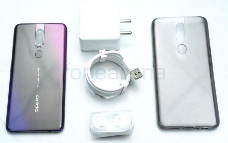
But back to Oppo's new handset. It has a classy gradient colored back that's reminiscent of last year's Find X, although the material of the back feels decidedly less dense. I can't quite make out the material, but I'm thinking it feels more like plastic than glass.
The vertical camera module is headlined by a 48-megapixel sensor that can capture better images by sheer pixel count alone–there's just more room to zoom, more image information for the software's image processing system to play with. Early test samples are looking promising, and can hang with the expensive Samsungs and Apples in all but the most challenging conditions.
A night shot in Hong Kong taken by the Oppo F11 Pro, compared with two pricey flagships from Apple... [+] and Samsung.
Ben SinAround the front is that 6.5-inch LCD display that's great to look at by virtue of being entirely uninterrupted, and the pop-up selfie cam is a 16-megapixel, f/2.0 shooter. Both of these perform well, especially in this sub-$400 price range. There is, however, no in-display fingerprint reader like the one found in the Oppo R17 Pro or Vivo V15 Pro, instead this F11 Pro, which is about $50 to $100 cheaper than the aforementioned two devices, shaves costs by using a traditional rear-mounted fingerprint scanner.
Powering everything is the Helio P70 chipset from MediaTek and 6GB of RAM. The P70 is a capable 12-nm processor that prioritizes multi-core performance. On the Geekbench benchmark app, it scored an above average 5,990 in multi-core performance.
Another photo sample captured by the Oppo F11 Pro.
Ben SinRounding out the specs is a 4,000 mAh battery cell that can charge at very fast speeds, thanks to Oppo's industry-leading charging tech. Unfortunately, as is the case with its sister brands Realme and Vivo, Oppo decided to give the F11 Pro a micro-USB charging port, too, which will annoy every tech-savvy user.
The most exciting change to this device from the previous Oppo release is the new software, ColorOS version 6. I've covered this in my Realme 3 review already, so I'll keep it short here: ColorOS 6 is vastly superior to previous versions. It offers an app tray, useful swipe gesture navigation, and a clean, Google-like aesthetic. ColorOS 6 is now one of the best Chinese Android skins out there, although OnePlus's OxygenOS is still king.
I've only had limited time to test the device, but I'm confident this will be another mid-tier handset that offers more value than what the flagships offer. This is increasingly the game Chinese brands are playing–release $300-$500 handsets so good, it makes $1,000 phones look overpriced. But they're also pumping out so many, it's worth wondering how much longer the market can sustain this mass saturation.
